iOS 9 review: Apple finally focuses on stability and smarts
iOS 9 review: Apple finally focuses on stability and smarts
Two years on from the biggest design overhaul of iOS, Apple has finally started to iron out the kinks. iOS 7 was notorious for being unstable at launch and many people struggled to get iOS 8 onto their phones, because it was such a huge download.
iOS 9 brings a number of new features to both iPhones and iPads – but not an overwhelming amount. Just enough to get you interested, along with a bevy of fixes and handy smaller features you’ll appreciate over time.
It’s clear that Apple spent a lot of time cutting down on the instability and making it easier for those with slower, smaller iPhones to upgrade.
The largest improvements are found on iPad and inside Apple’s personal assistant, Siri, but iOS 9 is also about fundamentally improving the foundation that Apple’s hardware is built on.
So, is iOS 9 worth installing?
A smarter assistant

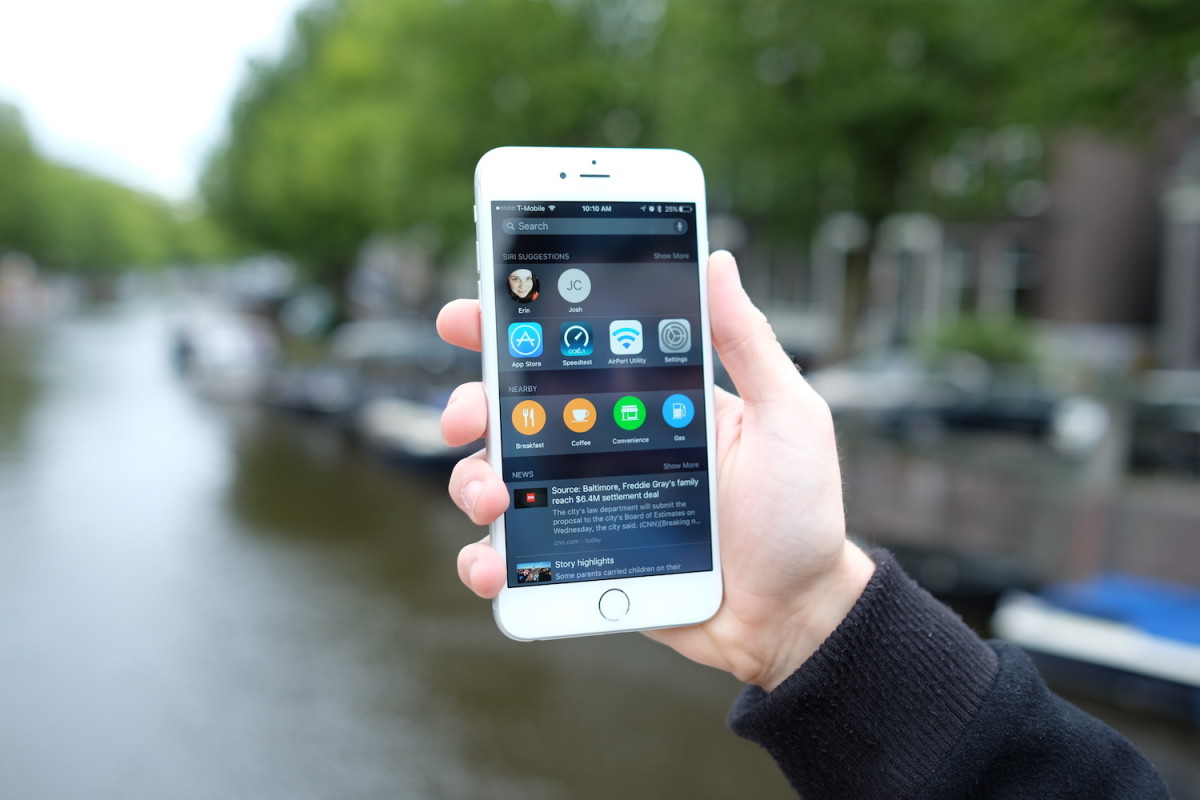
Apple’s trying to wean you off Web searches slowly by providing you results from apps on your phone, Web searches and other sources as you type out your query.
For the first time, app developers can offer up the data previously locked away in their apps for indexing, so your searches turn up results from across your iPhone.
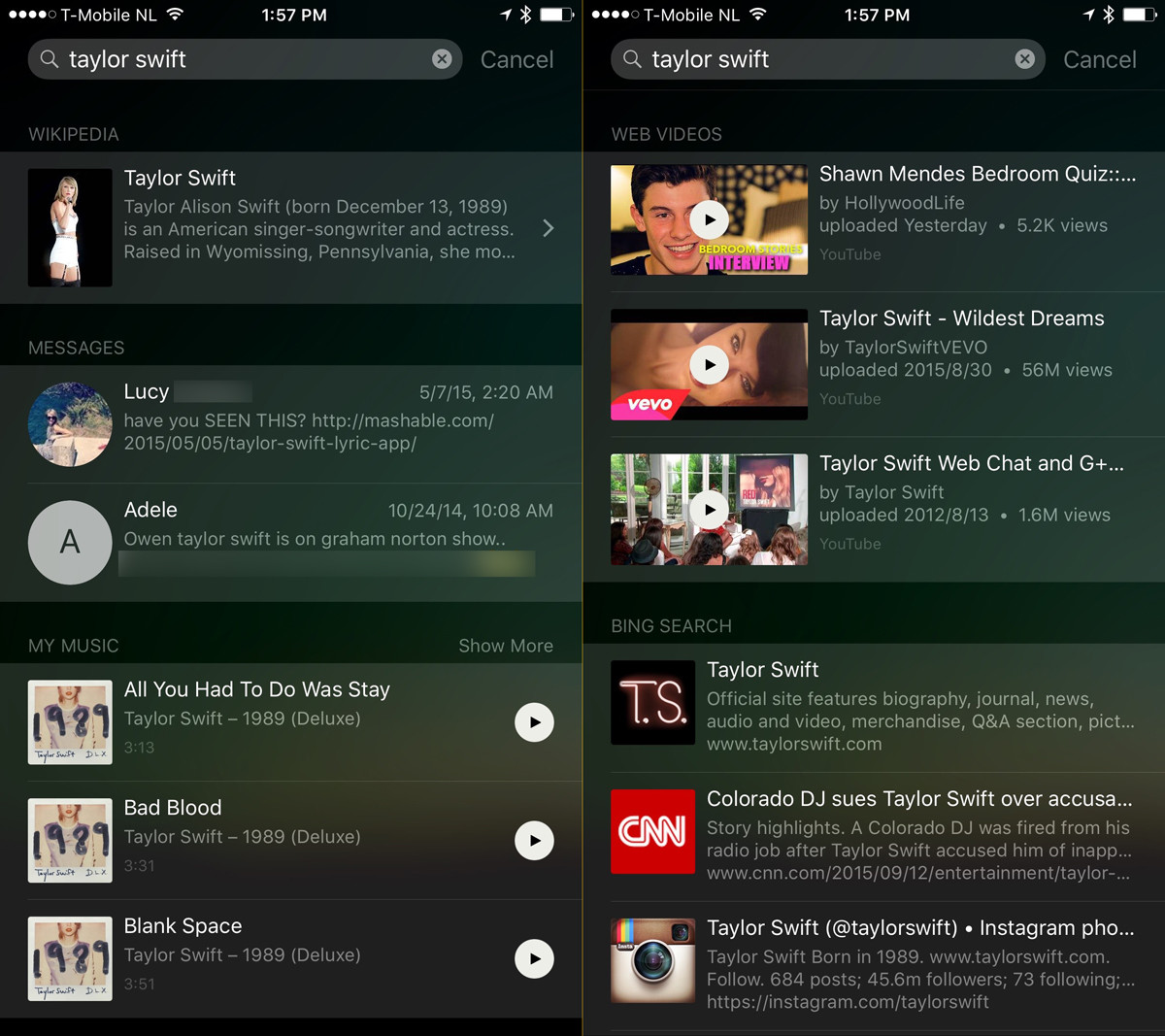
Search for Taylor Swift, for example, and you’ll see the Wikipedia page, conversations where you mentioned Taylor, songs from your phone, Web videos mentioning Taylor, tweets from Taylor and finally, Bing results.
These results will get more interesting over time, as developers are able to plug results from within their app into Spotlight — in the future Instagram photos could appear, along with the latest listings from Spotify and other apps.
Eventually as a broader amount apps support the feature, it’ll be easier to get directly to the information you want, rather than jumping around the internet.
You can also perform currency conversions and math equations within Spotlight — something I personally relied on Google for far too frequently in the past.
 Proactive Siri offers up interesting suggestions based on different sensors, location and the time of day.
For example in the morning you might see your partner listed, along with nearby suggestions for ‘breakfast’ — tapping that opens up Apple Maps with suggestions of where to eat in your area.
The coolest feature here, though, is the subtle new alert that appears on the bottom of your multitasking screen that guides you to what your iPhone thinks is what you want to do.
Based on the time of day, your location and various other factors, you’ll see suggestions for what app to open.
In the morning, my iPhone suggests I open Twitter (which is slightly embarrassing). When I plug in my headphones to bike to work it suggests I open SoundCloud. In the evening, it suggests Mail.

Now your phone constantly learns what you want to do and suggests it to you at the exact moment you need it — sometimes the suggestions are so on point that it’s creepy, but it’s more useful than having to search for an app. Every time I plug in my headphones I just double tap the home button, then click the suggestion.
Siri was introduced almost four years ago, which feels like an age, yet today many of us haven’t used the feature for much more than setting a few reminders and telling a joke. The new Siri is getting a big upgrade, in part to take on Google Now, though Apple is tackling it in a different way.
Siri’s now faster and leaner than ever – you can search for more than you ever could have in the past, like sports game scores, and ask her to remind you about things you’re looking at on screen. If you’re looking at something cool on a store and want to remember it later, just hold the home button and say “remind me about this when I get home.”
These are genuinely impressive improvements, but stand in stark contrast to what Google is offering with Now On Tap. Google automatically scours your inbox, contacts and other data to offer up suggestions like when your next flight is, automatic meetings and more.
Here’s the thing: I think Apple is perfectly OK with that. One thing the company made sure to emphasize during WWDC in June is that your data never leaves your phone — these suggestions are made to you without information ever being transmitted to Apple and it doesn’t need to scan your data on a server to get smart suggestions.
That’s cool, but it means Apple is somewhat limited in what it can do here. You’ll get neat suggestions like “traffic on your way home is busy right now” or an educated guess on who might be calling you based on emails you’ve received, but it doesn’t quite go as far as Google Now.
You’ll dig the new Siri, a lot, but there is a caveat: a lot of the smarts require you to use Apple’s official apps — Mail, Contacts, Calendar — to fully enjoy the new features.
That means you’ll need Mail, Calendar and Contacts fully working, or suggestions aren’t going to be very good — that’s on purpose, to give you another reason to use the built-in apps.
Finally, a back button
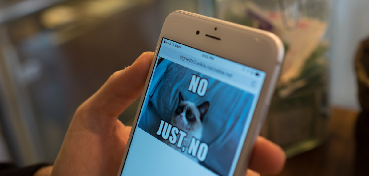
There’s a small but powerful new feature that you’ll start noticing everywhere: a back button in the top left corner when you jump from another app. That new back button helps you remember where you came from and provides quick jumps back to your previous task.
It’s one of those additions I thought wouldn’t matter at all, but absolutely changed the way I use my iPhone. It gives context where you need it — you know exactly why you came to an app and how to get back to where you came from.
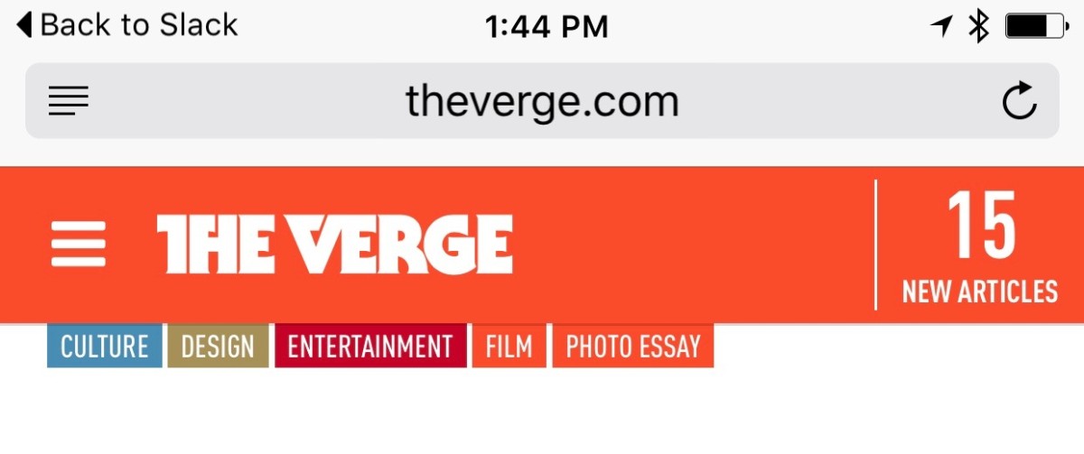
That arrow appears when you open an app from Spotlight searches and when an app hands you off to somewhere else — like opening a link in Safari from Slack. It’s very useful for situations where you need to quickly whip into another app for something, then jump back without messing around.
You’ll notice it appearing all the time, and I bet you’ll use it more than you expect. It’s quite literally what the back button on Android is supposed to do, but without a hardware button.
Apple Maps
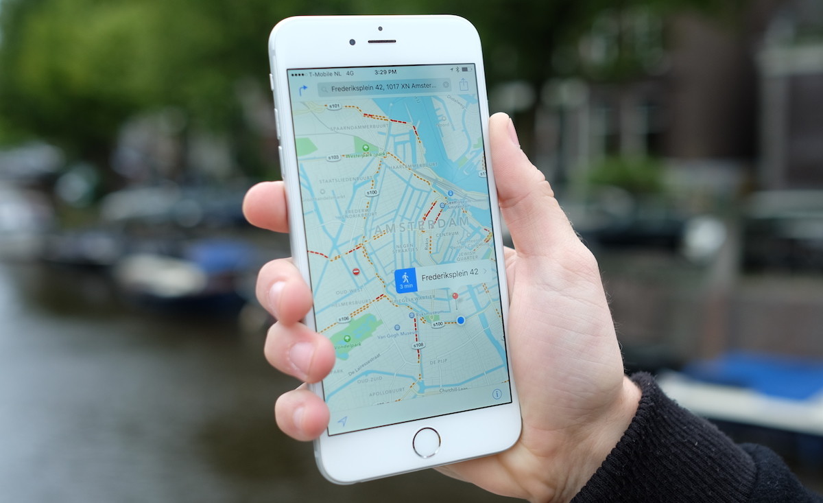
Apple Maps has had sizeable improvements in iOS 9 as the company pushes hard to make it better. It’s added public transit directions and nearby places support, which are welcome additions… but only work in the United States.
In iOS 9, Apple Maps added transit features that tell you just how long your trip will take via public transportation. It’ll also give you info on which entrance is best for a subway station or similar hub.
If you’re planning a trip, you can schedule multiple transit mediums; go from a subway to a walk, then hop on a bus.
Perhaps the best Apple Maps is the one that serves as a backbone to other services. As mentioned earlier, Apple’s new Proactive feature, which sits just left of the home screen, offers to find you coffee houses or restaurants via its ‘Nearby’ tab. When you do, it directs you to Maps for locations, and services like Yelp for reviews and menus.
It’s a clever way to draw in those that don’t use Apple Maps as their go-to app for directions, and might show you just how good it really is at things beyond turn-by-turn directions.
Many people might discount Apple Maps as a failure after the rocky launch a few years ago, but it’s time to take another look. What’s actually amazing is that the majority of iPhone owners use Apple Maps full-time already.
People love to hate on Apple Maps in tech circles, but the crazy thing is that 78 percent of iPhone users use it anyway. They don’t know the difference — it’s right there on the phone, ready to go without any additional download — that’s the power of defaults.
Ad Blocking
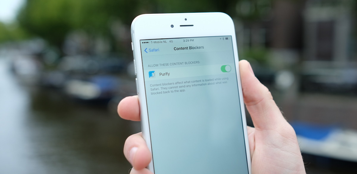
‘Content blocking’ is Apple’s official name for what boils down to ad blocking on the Web. I’ve covered pre-release content blocking apps extensively over the past few weeks and believe they’re about to have a huge impact on the way people browse.
These new applications will be downloadable from the store and can block many types of content on the Web, not just advertising. Some blockers will disallow just ad tracking while others remove social share buttons, advertisements or other annoyances.
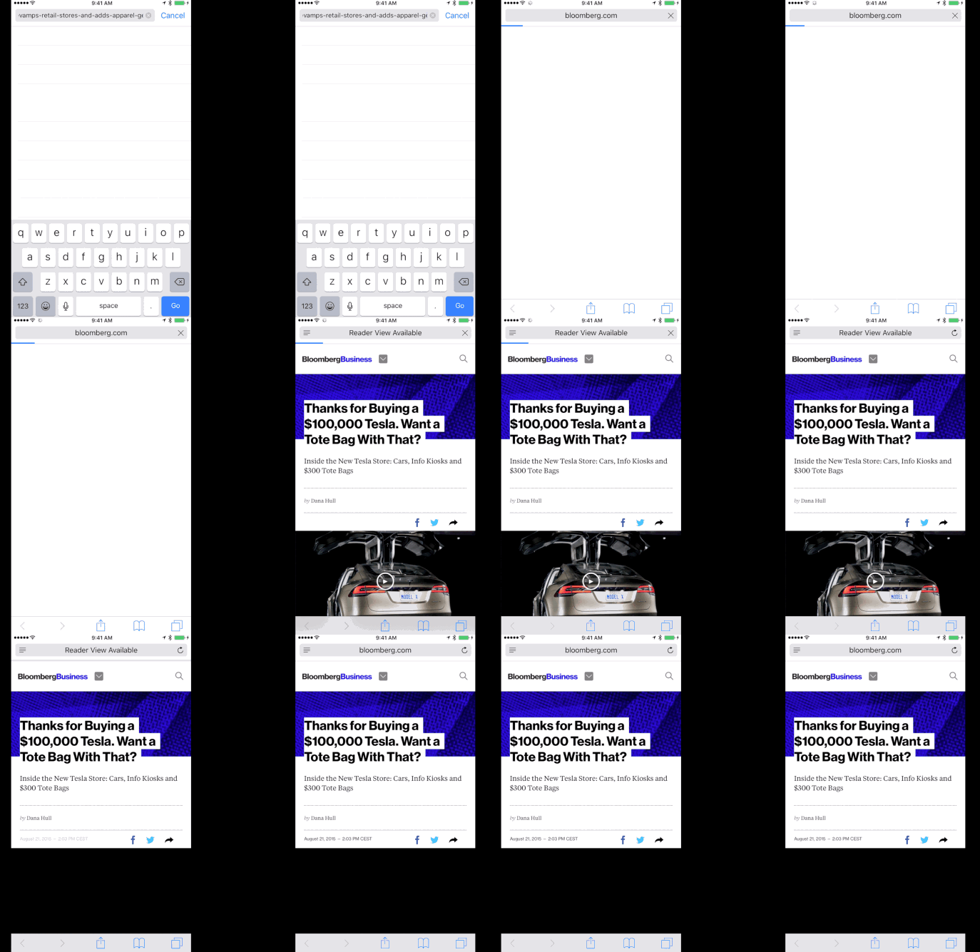
In testing over the last month, I found that upcoming blockers have the largest impact on publisher websites, such as Bloomberg, where load times and page sizes often balloon due to the rich media shown.
They also show potential to have major impact on third-party scripts marketing people use, such as Google Analytics, Parse.ly, Chartbeat, Optimizely and others, who also get caught up in the net. It may mean measuring your audience on iOS gets a lot harder in a few weeks time.
It’s still early days — content blockers like Purify and Crystal should start appearing on the App Store from today — but I suspect they’ll quickly gain popularity as word gets out that you can save both your mobile data and precious seconds in load times.
Apple News
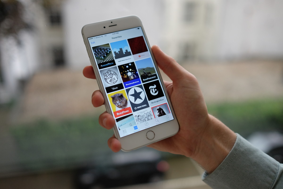
One of the new apps bundled with iOS 9 is Apple News — if you’re in the United States. The app is Apple’s fresh approach to getting publishers to take iPhone seriously, after Newsstand failed to gain any meaningful traction.
Here’s the thing about Apple News: it’s really, really good. That’s something publishers, bloggers and anyone who puts words online for money should take seriously — it might become iPhone owners’ most visited go-to place for getting the latest news.
I really dig Apple News. It’s a fresh, clean and damn speedy alternative to dedicated news apps out there right now like Flipboard. Most of all, I like it because it cuts news down to the basic, readable, raw form, without annoying modals and crappy advertising.
Apple’s new secrecy-shrouded Web standard has only been shared with a limited number of publishers including The New York Times, Vox and BuzzFeed, but it shines as an impressive way for publishers to easily design attractive news stories.
The weirdest part of Apple News is the lack of push notifications. While dedicated news apps like NYT Now and BuzzFeed News get tasteful breaking news notifications, there are none to be seen in Apple News.
Even weirder, you might see a vague “check out the news” alert that’s related to nothing in particular. It’s possible that it’ll ramp up with real notifications as it hires editorial staff to send them — we’ll update this section if that changes.

In the future, I’m hopeful Apple will let you opt-in to receive alerts from publications you trust, but for now, there’s no ‘sticky’ factor in Apple News to draw you back in.
While Apple did include social sharing in News, the app wraps social share links in a special URL — apple.news — that detects whether or not you’ve got the Apple News app installed, then opens it in that. That’s fine, but it means you don’t really know what your destination will be when you spot a link on social media.
Apple News is a good addition to the iPhone and I’ve been using it daily — you probably will too.
A leap forward for iPad users
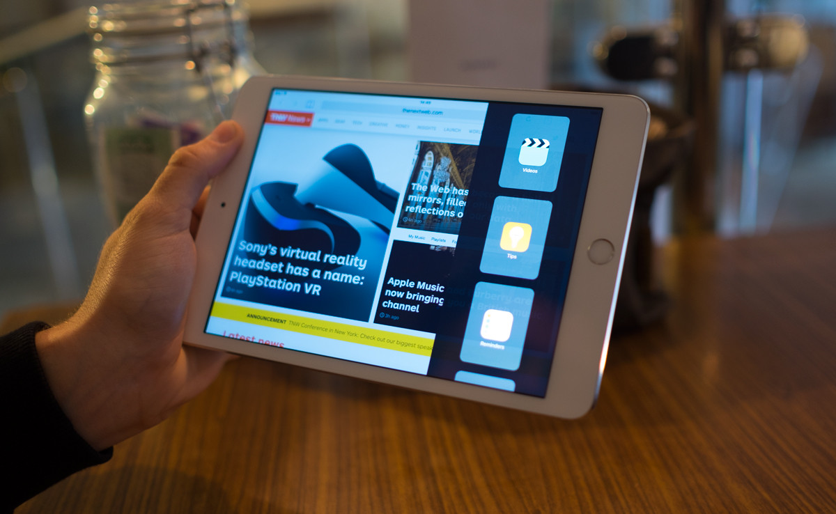
For iPad, iOS 9 brings some functionality that you won’t find on iPhone: multitasking features that finally allow you to run more than one app at the same time.
I’ve got the iPad mini 2, and while I can’t use the split-screen functionality those with an iPad Air can — I’m loving the slide-out multi-tasking feature.
When you slide a finger from the right side of the screen, a slew of app icons are shown. Tap one, and it shows up in the slide-out overlay as a minimal version of the app.
Drag down from the top, and the open app is dismissed back into the lineup. Tap anywhere on the ‘main’ screen, and the slide-out overlay goes away.
For simpler things like iMessage and email, it’s wonderful and finally brings the iPad into its own. Drop-down notifications don’t always get a timely reaction, but it’s nice to be able to respond later without disrupting whatever I’m doing.
Similarly, it’s nice to be able to use Safari for quick searches, or see my email at a glance without needing to leave the app I’m already using.
News is the same as you’ll find on the iPhone version of iOS 9, but I think the larger screen is better for reading. The same can be said for Notes, where I find a larger screen better for complex to-do lists and sketches.
This section thanks to TNW’s Nate Swanner
Making space work
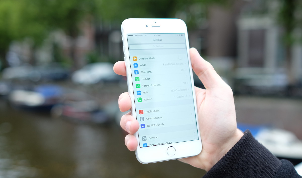
One of the biggest focuses with iOS 9 is on making Apple’s software work better on smaller devices. iOS 9 includesthree big steps forward for those stuck with a 16GB iPhonethat should help relieve the pressure.
First, the update itself is just 1.3GB this time around, compared with iOS 8’s 4.58GB, so it’s much easier to install than last year.
Second, Apple has included a new option that allows you touninstall apps taking large amounts of space so you can perform the update, then it’ll automatically restore them once updated.
Third, a new technology for developers called ‘App Thinning‘ automatically strips out the parts of apps your phone doesn’t actually use.
In the past, you’ve needed to download the images, code and other bits for other devices too when you install an app, but now it’ll only grab the bits for the type of device you own which reduces the space it takes.
This time around, it’ll be much easier to update your phone and less of a nightmare to keep enough space available to take photos.
Battery life and performance
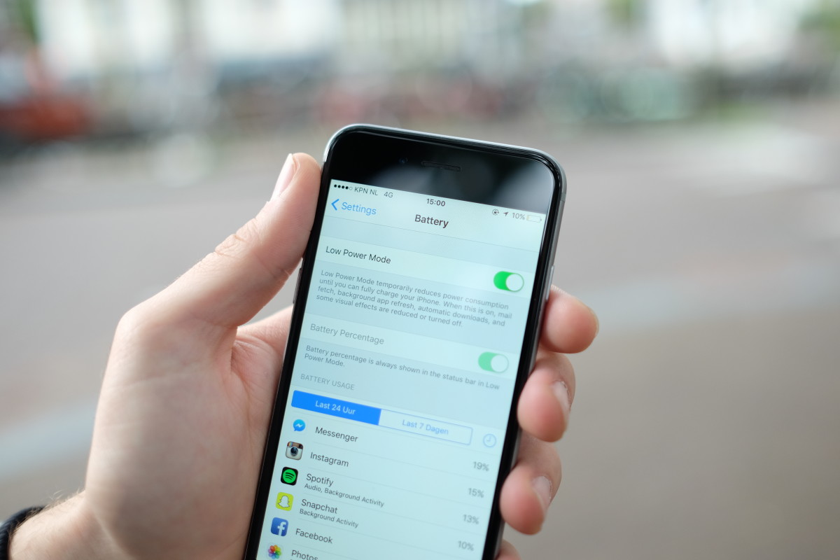
Apple says that battery life on devices running iOS 9 should see an additional one hour before requiring a charge and I’ve found that to be true. My iPhone 6 Plus definitely lasts longer every day.
One of my favorite new features, ‘Low Power Mode,’ seriously stretches battery life on those days you really need every minute if you expect to be away from a charger for any long period.
Flip it on and your iPhone will check email less, disable background apps, automatic downloads and visual effects to make your phone last. In this mode, the phone runs noticeably slower and some animations either don’t display at all or lag — but that’s fine, because all you care about is battery life.
Each time I used Low Power Mode, it stretched my iPhone’s battery well beyond a day with ease. When it’s enabled, apps like Snapchat, Facebook and Twitter take what feels like forever to open — as you’d expect, because performance is being throttled.
Low Power Mode is a hugely welcome addition for me, the paranoid phone owner that carries backup batteries, and will be particularly useful at conferences like Google I/O or weekend-long music festivals where I need to squeeze out every minute I can get.
New fonts, keyboards and other small changes
A lot of smaller things have changed, too. Apple’s self-created font, San Francisco, which was first adopted on Apple Watch, is coming to both iOS 9 and OS X 10.11.
San Francisco looks nice everywhere, but takes a little getting used to at first. Font die-hards will swear Helvetica Neue was a better choice, but San Francisco feels like a natural, inevitable choice to me that I like — and no, there’s no way to change it back.
The keyboard has had a nice tweak too. For the first time since iOS was released, the characters on the buttons themselves actually change case when you press the shift key.
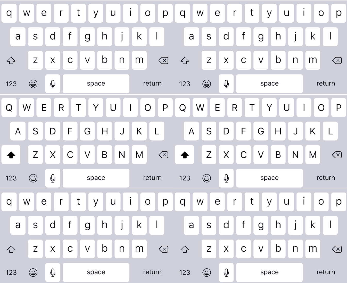
It’s inexplicable why this wasn’t changed sooner — like during the drama over how people couldn’t figure out if the shift key was pressed and the ensuing changes in iOS 8.
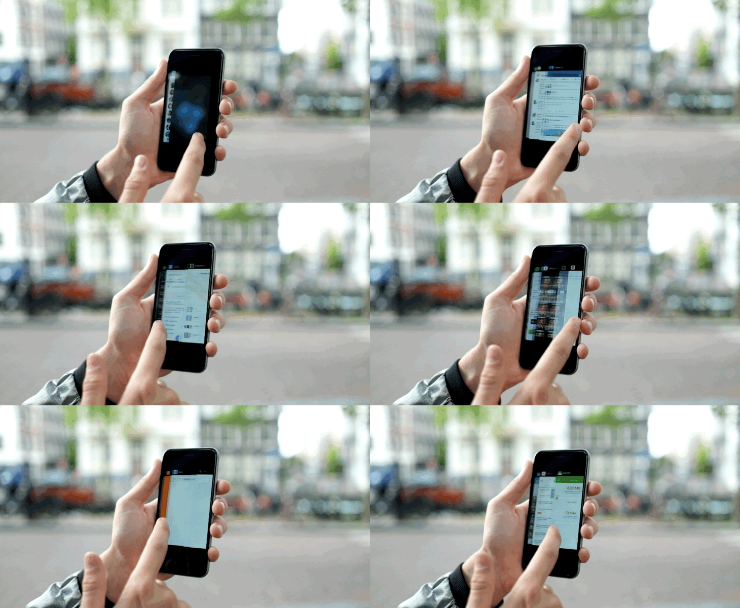
Multitasking looks different too, and it might confuse you at first. It now shows as a stacked card view instead of the older side-by-side layout. Swipes to look through open apps now go in the opposite direction, from right to left.
For the first week or so the new layout confused the hell out of me — three years of habits to re-learn — but I can honestly say I prefer it, for the most part. It’s faster to get around when you have a number of apps open, but it’s a little annoying for peeking at the full screen of an app without actually jumping into it.
Wi-Fi Assist is a new feature you probably won’t ever notice, buried at the bottom of your Wi-Fi settings and turned on by default, but it’ll make your life better.
A frequent problem of mine was when walking away from my home or work network, the iPhone would desperately stay latched to the connection even if nothing would load. With Wi-Fi Assist, this shouldn’t happen anymore — your iPhone automatically jumps to cellular data if the network connection is bad or slow.
Notes also got a number of sizeable improvements that should help it take on more sophisticated apps like Evernote. You can now add sketches, images, links and other formatting like bold, italic and bulleted lists. Most notably, it now syncs using iCloud Drive instead of the IMAP email protocol which basically never worked properly in the past.
You’ll also be asked to set up a longer PIN code if you’re setting up a new phone — the default is now six digits, for extra security.
Verdict
Here’s the deal: this is a great upgrade and you should do it today — it’s worth it. iOS 9 fixed all my major issues with the software from both iOS 7 and 8, while adding thoughtful enhancements that make it much easier to use.
It’s far easier to upgrade, since you’ll need less free space. The improvements to Siri, proactive suggestions and battery life enhancements alone are worth upgrading for right now and overall iOS 9 is faster and more stable than any previous release.
I’m slightly disappointed the new emoji, which are expected to be released as part of iOS 9.1, weren’t bundled with this release — it feels like the addition of those would’ve rounded out the update nicely.
iOS 9 is available for iPhone 4s, 5, 5s, 6 and 6 Plus owners from today, as well as the majority of iPad owners.
You can update by opening the Settings app, tapping on General, then Software Update.


