TouchPTCL Self-Care Android App Gets New Features And Design Overhaul
TouchPTCL Self-Care Android App Gets New Features And Design Overhaul
PTCL’s self-care Android app has received a complete design change in the latest update. The latest update of TouchPTCL Self-Care Android app started to roll out on the 5th of December. The new app offers a much more modern design along with additional package information and improved functionality.
Design
The changes become visible as soon as you launch the new app. The old icon has given way to a higher-res logo icon, keeping in line with Google’s recommended practices. However, the new icon doesn’t stand out in your app drawer like it used to.

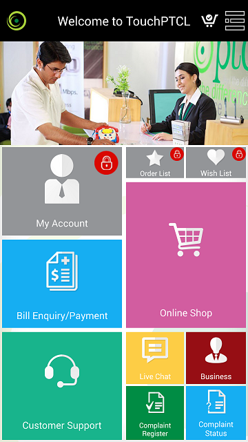
Design-wise, the app holds no similarity to the latest trend of app designs. The app looks more like a Windows Phone home page than an Android app. But it doesn’t go well with Windows app design guidelines either. While the app uses square tiles, these are plain buttons and the colour scheme looks more in line with Android apps of present. It is also visible that the app takes its design cues from the Ufone Selfcare app and we wouldn’t be surprised to hear that the same developers were behind both apps. In short, the self-care Android app holds no design elements from the trendy Material design.

New Features
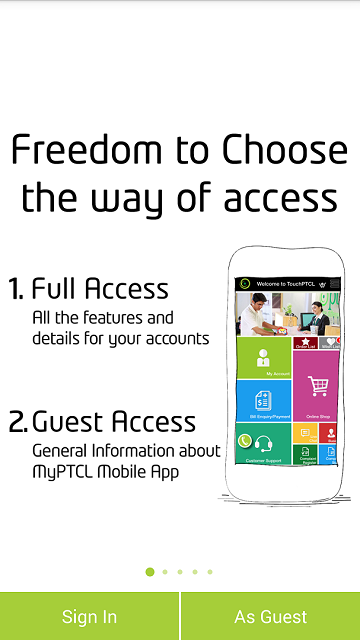
As soon as you launch the app, a guide pops up showcasing the new features of the app. Users are offered a navigation guide and a brief overview of the app features in five screenshots. The new Shop Assistant and additional useful links are also showcased. Popup screen also asks whether the user wants to use the app as a guest or sign in with a PTCL account for a much better and detailed experience.
As of now, signing up for a new account from within the app seems to be not functioning for most users and the only options are to sign in with a previously created account or use the app as a guest. We hope the app developers are working on a fix for this as we speak.

App Functionality
All the options available from within the app show up on the home page. Bigger tiles show oft-used features like Account & Bill information, Customer Support and Online Shop. While the smaller tiles show the functions that might be used occasionally.
Signed in users will be able to access their account page offering details about their subscribed packages and tariff details. They will also have access to the order list and will be able to place orders from within the app.
Bill Enquiry section offers details about the current status of the bill for Evo and Broadband users. Users can pay their bills via Credit/Debit cards as well. Guest users will require the account number to access their bill details.

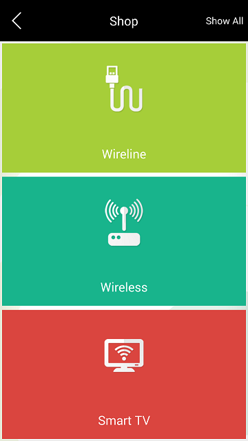
There is a new Shop Assistant section as well. It contains almost all the different services and packages on offer from PTCL. Users get to choose from the simple option of Smart TB, Wireline and Wireless services and view or select any package details they desire. There is social network integration in this section as well. Users will also be able to rate different packages but we don’t know how well that will turn out for PTCL, considering their customer service standards.
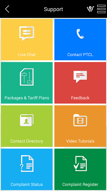
The support section offers additional information about PTCL products and lets users contact the PTCL helpline. Users can also register complaints from within the app and view package and complaint details. You can also chat with PTCL representatives to get issues resolved in a more timely manner (no more waiting for hours when calling the helpline). Adding new packages to a wishlist is also a welcome addition.
Where to Download the App?
The app can be downloaded from here. Let us know your impressions of the app in the comments.

