Big Chrome OS change coming: A launcher overhaul adds Google Now
Big Chrome OS change coming: A launcher overhaul adds Google Now

The Chrome app launcher overhaul puts a greater emphasis on search and contextual information
Some hefty changes are coming to Chromebooks and Chromeboxes, including a new app launcher with Google Now built in.
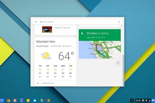
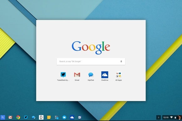
The new launcher is available now in the Chrome OS beta channel, and it’s a major departure from the existing version. Instead of a small pop-up that shows all your apps, the new launcher brings up a larger window in the center of the screen — one that looks kind of like Chrome’s “new tab” menu.
Here, you’ll see the Google logo on top, followed by a search box. Your four most recent apps appear below your search box, along with a button to show “all apps.” Beneath these apps, the launcher will show information cards from Google Now, similar to how they appear on phones and tablets.

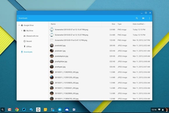
The latest beta includes a few other new features as well. Users can open password-protected ZIP files, and an option in Settings can automatically the time zone based on location. Google is also bringing Material Design to its Chrome apps, and the Files app is the latest to get the new look.

To try the beta channel, head to Settings, then click “About Chrome OS” at the top of the window. Click “More info” and hit the “Change channel” button. Restart, and click the “Check for and apply updates” button in this same menu. If you’d rather stick with the stable channel, the beta features usually take about a month to make their way over.
Why this matters: Some users will probably be unhappy with the new launcher, as it adds an extra step to the process of opening Chrome apps. But if you already pin your favorite apps to the Chrome OS taskbar, the old launcher probably wasn’t too helpful anyway. The overhaul puts a greater emphasis on search and contextual information, so it seems like a better use of easily-neglected space.
